Turning Linear Search into a Performant Data Processing Engine
Filter 25 million property records by 87 criteria in under 100 ms (p99) to help decide where to buy a home.
The pitch
There’s an immense amount of public, highly granular data about the UK, especially England and Wales: the prices of millions of recorded property sales1; floor areas and construction years2, all with full addresses; street-level crime3; noise levels at 10 m by 10 m granularity4; public transport timetables5; mapped woodlands6; conservation areas, council houses, listed buildings7, and schools8; plus detailed demographics9 on education, renting, and a lot more. When I was looking to buy a property, these datasets helped me narrow down where to move and what to expect.
Sites such as HouseMetric10 and CrystalRoof11 already provide some of this data for a given postcode, but I needed the search the other way around. I had been living in London for only four years, so I didn’t know its many neighbourhoods well enough. That’s why I wanted to flip the lookup: instead of going from a postcode to its attributes, I wanted to go from the description of my ideal area to matching postcodes. This is how perfect-postcode.co.uk12 began.
Perfect Postcode introduced me to several hidden gems I’d never heard of but fell in love with after visiting. It pushed me beyond familiar areas and gave me a broader picture of London. It also showed me what my expectations would cost and how the equation changed with a compromise or two.
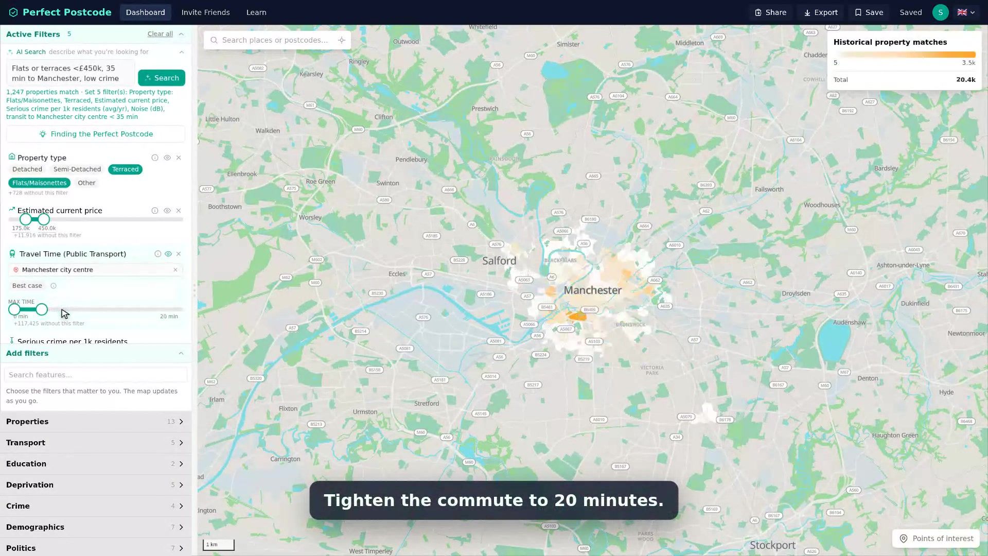
In short, users can set numeric ranges or choose allowed categories for property and area attributes. For example, a user can ask to see only areas within a 10-minute walk of a station, with noise below 56 dB, with a 2-bed costing less than £600k, plus any of the 83 other criteria. The result is a heatmap showing which areas contain the highest number of matching past sales, and therefore where the criteria are most likely to be met. From there, users can narrow their search, contact estate agents, get access to off-market properties, and keep an eye on Rightmove and Zoopla.
Rough architecture
Filtering happens per property: all the public data is joined onto roughly 25 million property records, which are then aggregated at various granularities. Matches appear as H313 hexagons at lower zoom levels and postcode boundaries at the highest zoom.
The basic architecture is straightforward: download the data, normalise and join it, add a filtering UI, then write a backend that returns matching areas. The difficult part is the main non-functional requirement: filtering must feel instant so users can see how each change affects the results to allow developing an intuition.
The full dataset contains 25 million rows. That’s really not that much data for today’s servers; it’s not too large to keep in memory, and it also won’t grow exponentially. That’s why I decided to see how far a brute-force linear scan could take me with it. Making brute force fast requires some preparation. So most attributes are quantised to 16 bits because values such as crime counts and room counts need no greater range or precision. There is only one index: a spatial grid (0.01 deg) that prunes addresses outside the user’s viewport. The data uses a row-major layout because queries often filter on dozens of attributes at once. Rows are also sorted by spatial position, so each scan touches contiguous chunks. This keeps scans cache-friendly and easy to parallelise.
After the intentional data layout, the brute-force search logic is as simple as for each row:
let base = row * NUM_FEATURES;
let should_include = filters.iter().all(|f| {
    let raw = feature_data[base + f.feat_idx];
    raw != NAN_U16 && raw >= f.min_u16 && raw <= f.max_u16
})
In practice, this results in sub-100 ms p99 query latency for our userbase which easily justifies the server’s roughly 12 GB memory footprint.
Still, 100 ms plus network latency is too slow for instantaneous feedback in the UI. Fortunately, filters are always combined with AND, and a numeric slider changes only one attribute’s bounds at a time. When a user starts dragging one, the frontend requests that attribute’s minimum, average, and maximum for every visible hexagon or postcode (with the active filter excluded). It uses those aggregates to recolour the map immediately and to dim areas whose value range cannot overlap the selected range. Releasing the slider sends the filter to the backend and replaces the preview with exact counts. You can see both stages in action here:
Of course, there’s a bit more to it, especially at the coarser H3 levels, where expensive queries benefit most from caching. Other data stays outside the hot path, including individual property histories and travel times. But the short version is that brute force can be the best solution when applied in a smart way.
Derived data
Besides the open datasets, the pipelines powering the app create interesting derived values, for example:
- Tree canopy density percentile: based on mapped tree-canopy and woodland coverage
- Price growth percentile: showing where prices are rising or falling fastest
- Public transport travel time: calculated between stations and neighbourhoods using R514 which is precomputed for every postcode and destination combination under several constraints
What’s next?
Six months of viewings and scouting areas in-person gave the perfect feedback loop. Whenever the numbers and my impression of an area differed, it usually pointed to a missing feature. For example, one Saturday we visited an area of Loughton that had looked perfect based on the numbers. However, we counted more than a dozen England flags hanging from properties, which prompted me to add a Reform UK voter share filter. Now that the product works well for us, it’s time to iterate on user feedback.
Originally, the app’s target audience was my fiancée and I. But as we added features, it became clear that other house hunters could benefit from it too. That meant improving the user experience with saved and shareable filters, clearer explanations, and a genuinely usable mobile site, then adding a payment flow and doing some marketing. Now, we’re looking at the usage metrics to see where to take the project from here.
- prices of millions of recorded property sales: https://www.gov.uk/guidance/about-the-price-paid-data↩
- floor areas and construction years: https://epc.opendatacommunities.org/↩
- street-level crime: https://data.police.uk/↩
- noise levels at 10 m by 10 m granularity: https://environment.data.gov.uk/dataset/562c9d56-7c2d-4d42-83bb-578d6e97a517↩
- public transport timetables: https://www.bus-data.dft.gov.uk/↩
- woodlands: https://www.forestresearch.gov.uk/tools-and-resources/national-forest-inventory/↩
- listed buildings: https://opendata-historicengland.hub.arcgis.com/↩
- schools: https://get-information-schools.service.gov.uk/↩
- detailed demographics: https://www.ons.gov.uk/census↩
- HouseMetric: https://housemetric.co.uk/↩
- CrystalRoof: https://crystalroof.co.uk/↩
- https://perfect-postcode.co.uk/↩
- H3: https://h3geo.org/↩
- R5: https://conveyal.com/↩