Making ticking To-dos more satisfying
Full-stack UX experiment for tracking goals as towers that grow with every finished task.
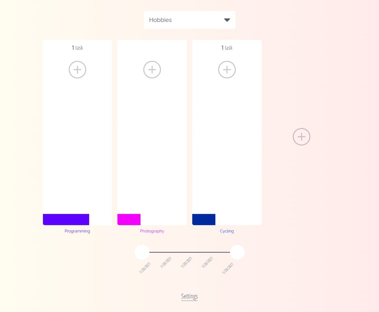
I love keeping todos. I also like simplicity and have never subscribed to the notion of over-optimising todo processes, either in my personal or professional life. So I always just aim to find the most convenient and minimal way of keeping todos, which usually ends up as a list of items I delete once I complete them.
In the late summer of 2019, it occurred to me: have you even done a task if you delete its todo? I wanted to keep track of historical todos in a stylised way so that they wouldn’t clutter up my list. That’s why I built the Life Towers goal tracker. It’s more of a UX experiment than a production-ready app, but it conveys my idea for todo management.
You can fill it with a bunch of tasks, and it only shows you the ones you actually want to see at a given moment. The tasks are organised under pages, with each page allowing you to add multiple sections. In my case, each section corresponds to a different aspect of life. The app also keeps track of all historical tasks but turns them into colourful squares that form a tower within each section to show how far you’ve come in different aspects of your life/project/hobbies. There’s a timeline at the bottom of each page allowing you to filter out old tasks or to time-travel and see the evolution of your towers through satisfying animations.
I still believe it’s an interesting idea, and I did use it for a few weeks, but its workflow is just a tad too prescriptive, requires too many clicks, and doesn’t allow for quick reorganising or note-taking, which I actually do quite often. In the end, it has proven to me that nothing beats a simple Markdown file.